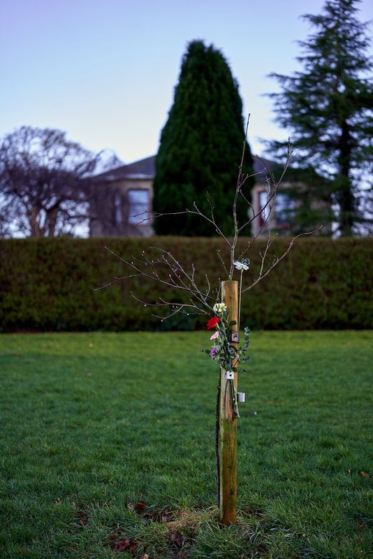
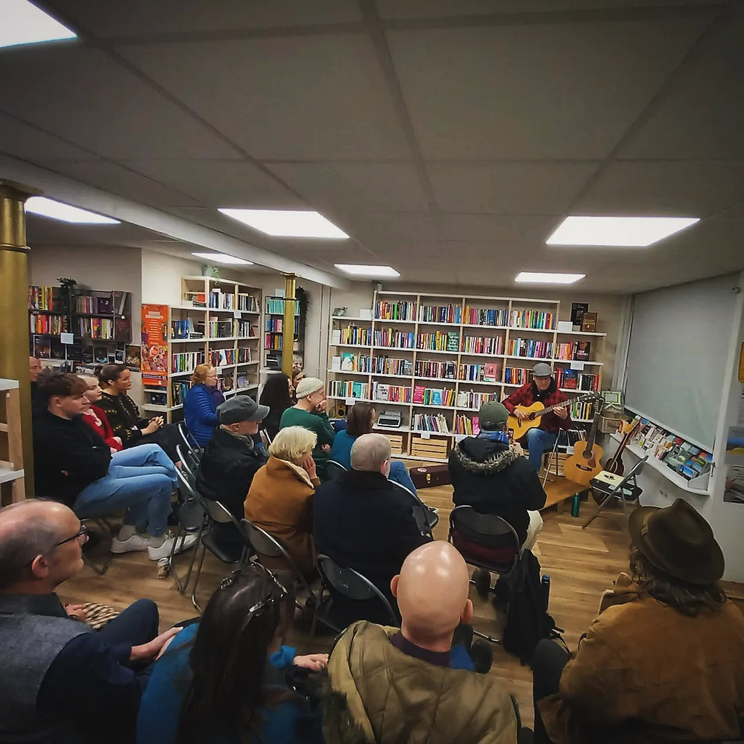
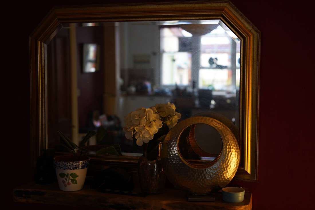
    Nothing too exciting here, just some documentation of a walk round the town. |
AuthorMusic and sound, news, views, opinions, photos, collage, moving image. Archives
June 2024
Categories
All
|
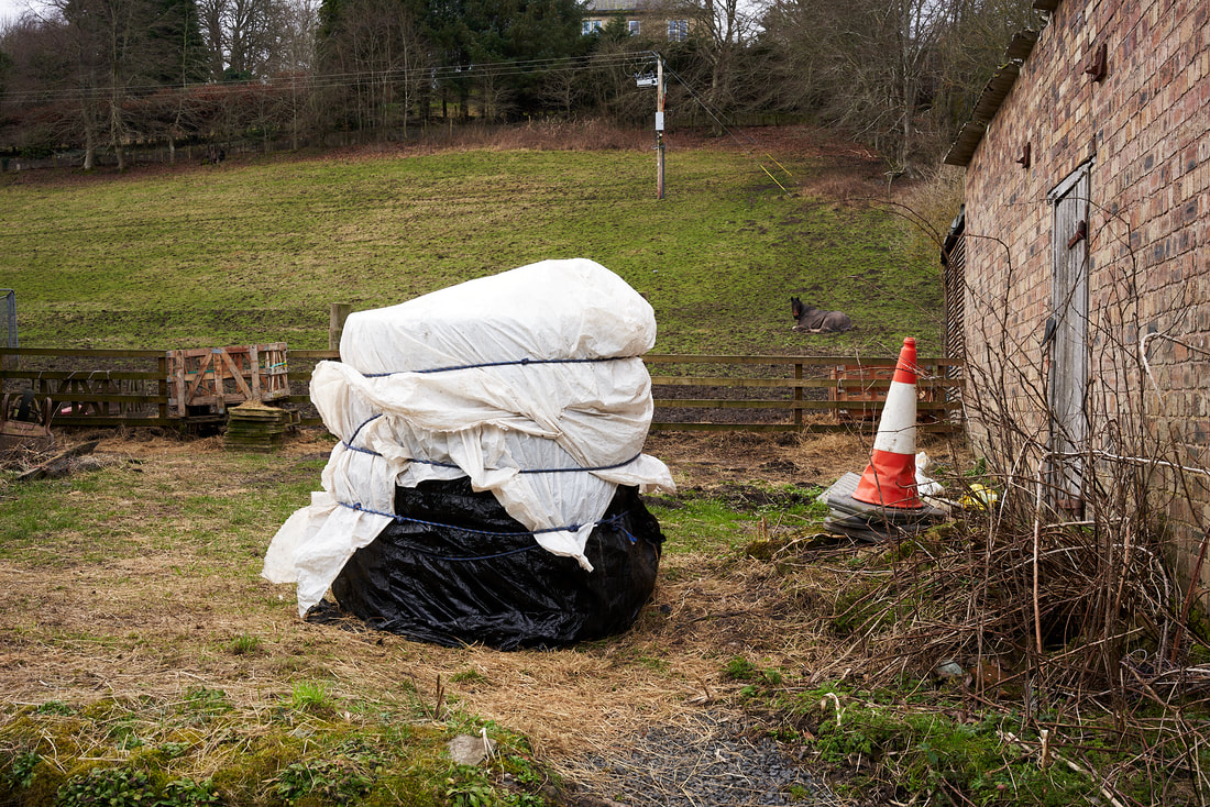
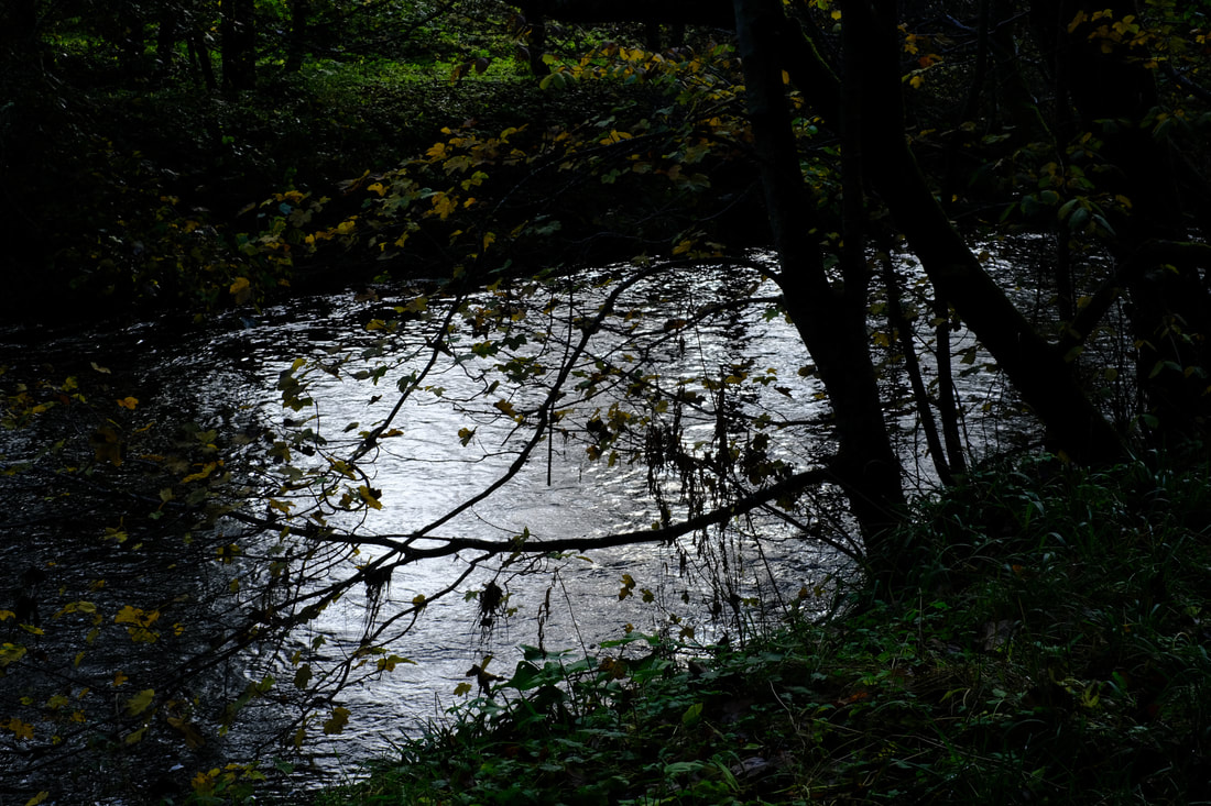
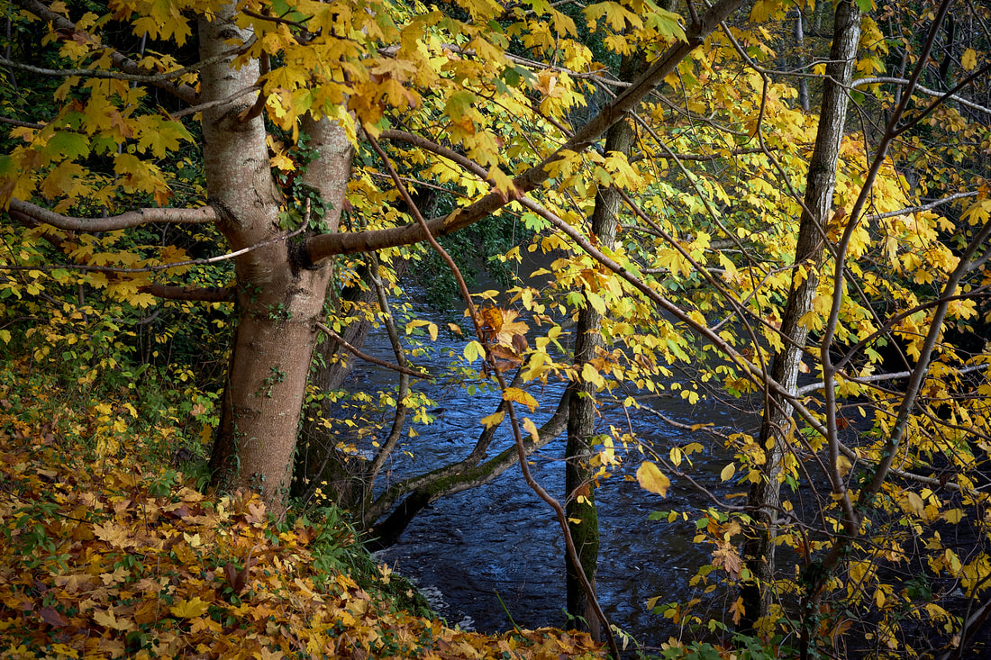
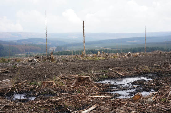
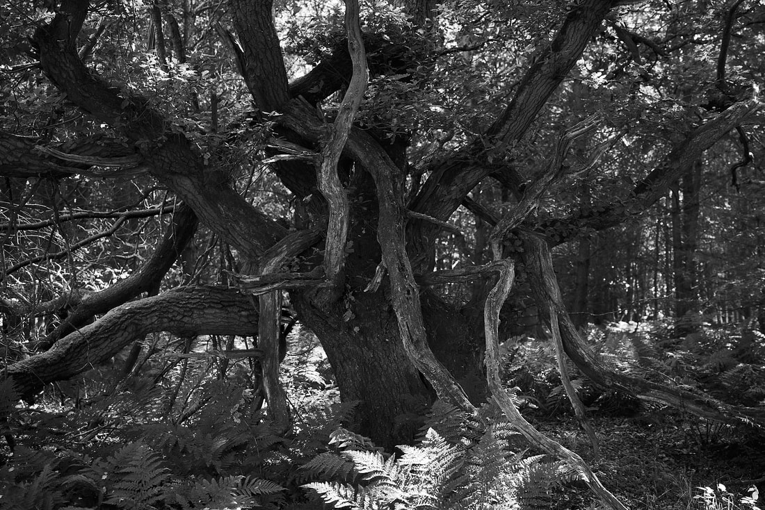
Nothing too exciting here, just some documentation of a walk round the town. |
AuthorMusic and sound, news, views, opinions, photos, collage, moving image. Archives
June 2024
Categories
All
|
 RSS Feed